UWE Christian Union
In my first year at university, friends who were members of the Christian Union asked if I could take a look at their branding. They explained this had not changed in several years and was long overdue a new look.
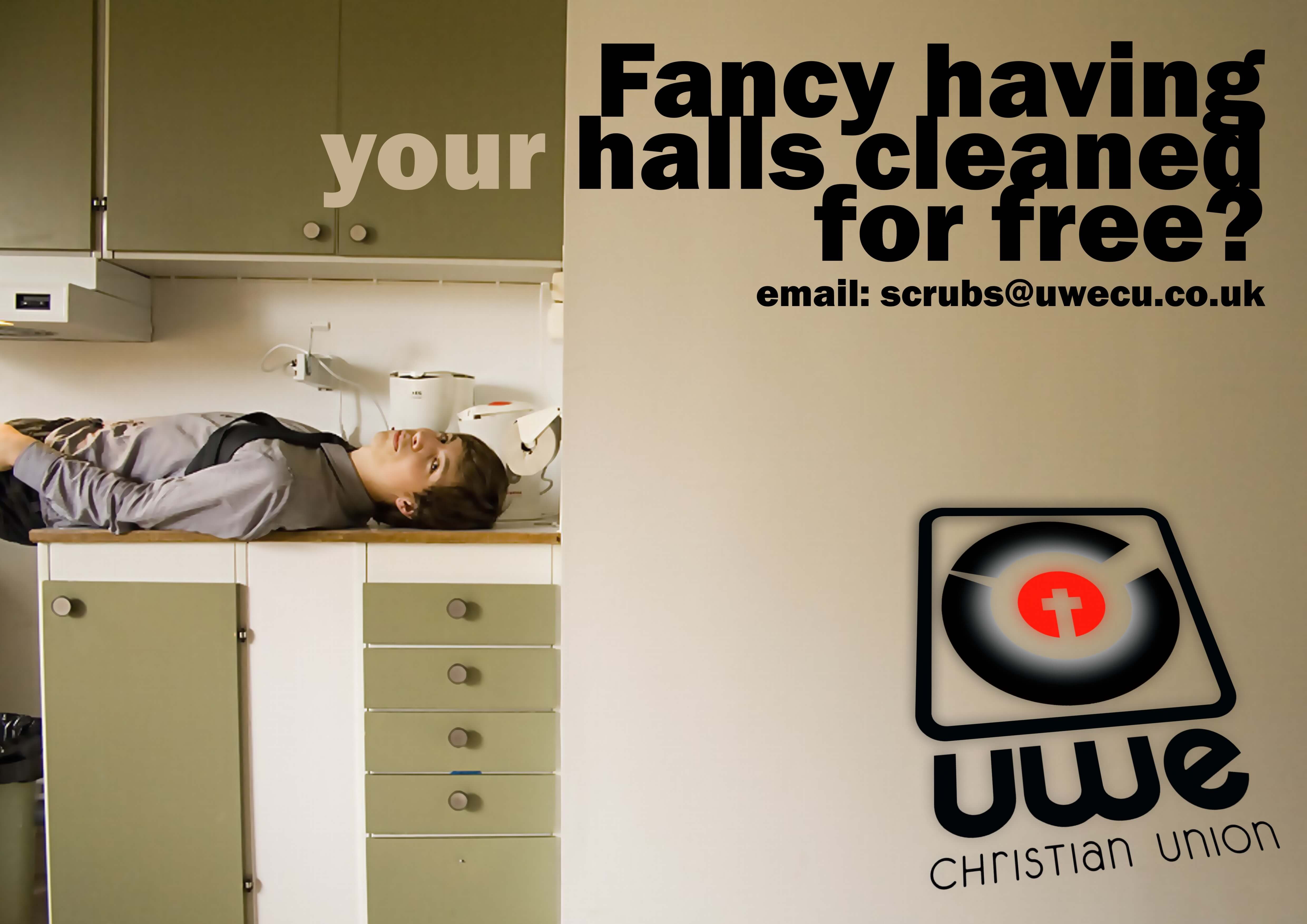
Looking at the design they had been using it was understandable that people were not paying attention. People ignored the various projects and services the union was providing for students. After examining the target audience, I provided a series of logo concepts that might resonate with the 18-21 age group. We settled on the above combination of the ‘C’ and ‘U’ with the Christian cross at the centre. This was then used in a series of playful posters that attempted to negate preconceptions of the Union. The goal was to disarm students and clarify the unions approachability.
Simple and effective — the uptake of the events and attendance grew considerably versus the previous years.


